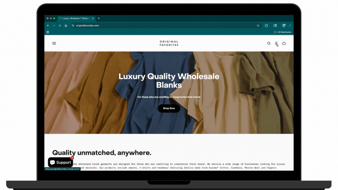
Website Redesign for Original Favorites
Rebranding of the entire look and feel of website in order to help align the user experience with the evolved brand voice and offerings.

Project Overview -
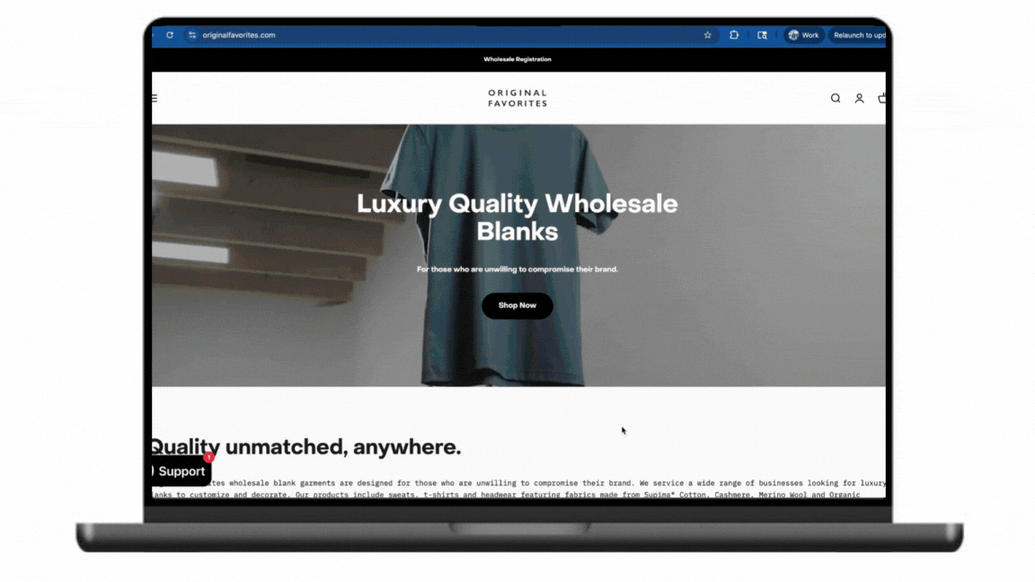
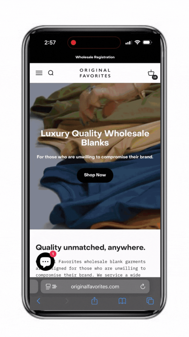
This project involved a full rebranding of Original Favorites's website, with a focus on improving both visual appeal and functionality. As the company expanded, their website no longer reflected their updated brand identity or effectively met the needs of their growing user base. My role was to lead the UX design process, working closely with the product team and stakeholders to create a user-friendly and visually aligned experience.
Duration: 9 months
Role: Lead UX/UI Designer
Collaborators: Company founders, front-end developer
Tools Used: Figma, Adobe XD, InVision, UserTesting, Google Forms
The problem that needs fixing -
The company’s website had become outdated and misaligned with its evolving brand voice and offerings. As their product line expanded, the site struggled to accommodate new features and services while still providing an intuitive user experience. Users were experiencing confusion during navigation, and the design felt cluttered. The project’s goal was to redesign the site with a new look, functionality, and structure to better serve users and align with the refreshed brand identity.
My Design Process -
I began by conducting user interviews and analyzing feedback from existing site users. The main issues revolved around confusing navigation and a lack of clarity in service offerings. I also performed a competitive analysis of industry leaders, looking at how their sites handled similar content. Additionally, I worked closely with the marketing team to understand the updated brand guidelines, ensuring the design would reflect the new voice of the company.
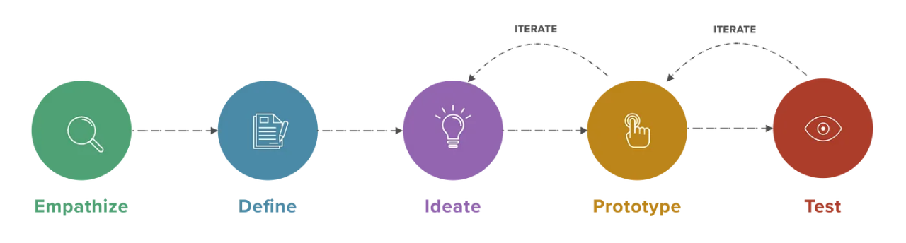
Empathize
Let’s start with the research -
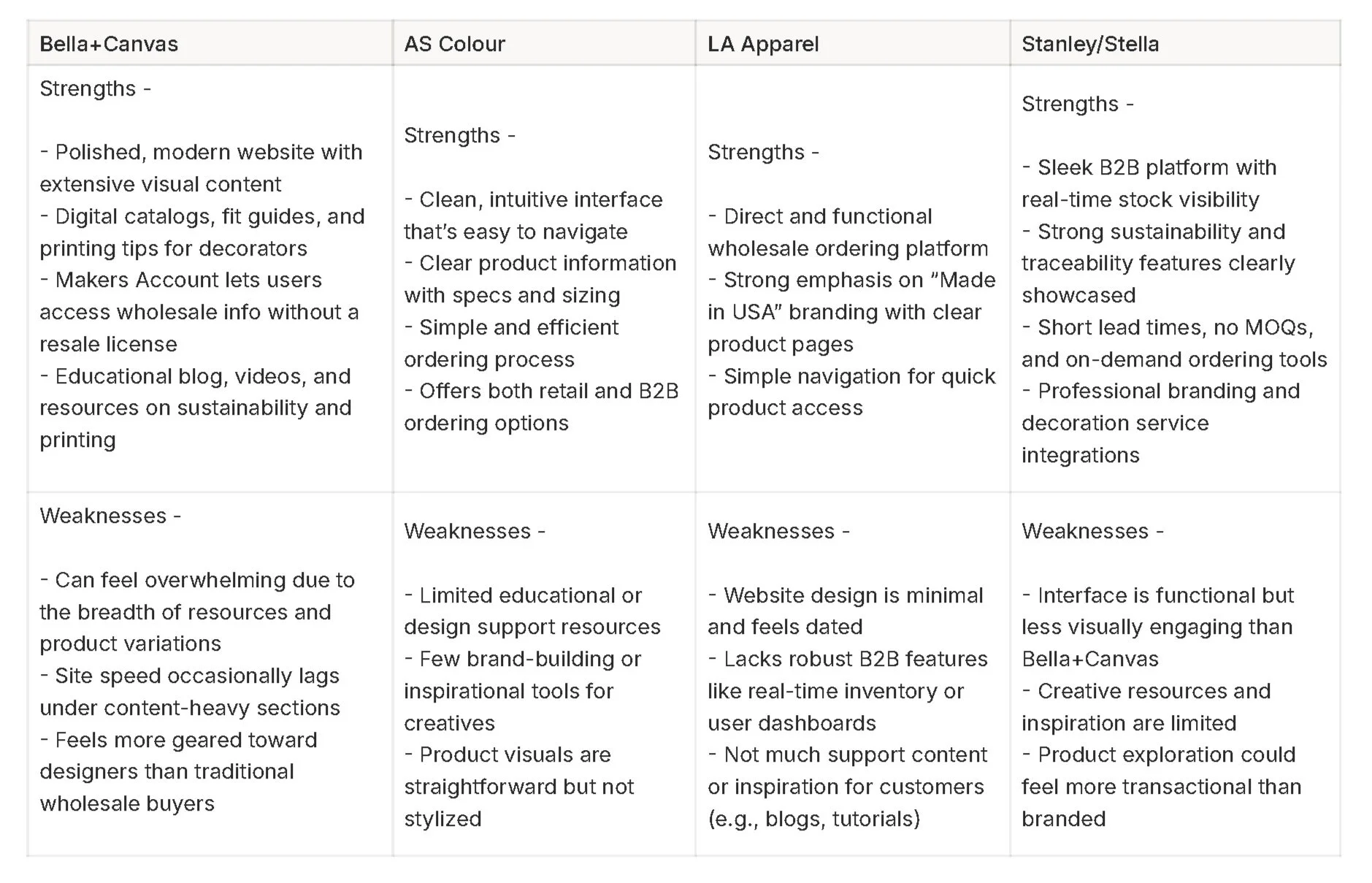
Competitive Market Analysis
The project began with an exploration of current market trends and B2B user needs. I conducted a competitive analysis of four other B2B wholesale clothing companies. All four competitors had varying features and catered to or met diverse needs.
User Interviews
Conducted in-depth interviews with 5 individuals from the target audience to delve into their B2B purchasing needs, challenges, and favorite existing tools.
Key Questions -
What are the primary challenges you face in your wholesale purchasing process for clothing?
Which features or tools (e.g., quick reorder, product filtering, inventory updates) would you find most valuable in a wholesale ordering platform?
What systems, websites, or methods do you currently use to manage your wholesale orders, and what limitations do they have?
Key Takeaways -
Buyers Need Faster, Smarter Reordering
Users want clear order history, reorder tools, and SKU-based navigation to make repeat purchasing easier. Many wholesale buyers expressed frustration around reordering products, especially when trying to track past seasonal orders. They often relied on spreadsheets or email threads because the current site didn’t support this need. This revealed a major gap in functionality — one that could be solved through features like quick reorder buttons, saved order templates, and better visibility of past purchases within user accounts.
The Site Feels More B2C Than B2B
The visual and content design didn’t meet the expectations of wholesale buyers, who need business-critical info upfront, not marketing fluff. Interviewees consistently noted that the website felt more like a consumer e-commerce store than a dedicated B2B platform. This mismatch in tone and structure made it harder for them to quickly evaluate products and make decisions. The rebrand needed to include not just updated visuals, but also a clearer hierarchy of information, separating general storytelling content from wholesale-specific tools and specs.
Style Differentiation Is Unclear
Users struggled to distinguish between similar-looking styles within collections, making them hesitant to place first-time orders without physical samples or clarification from sales reps. Many buyers noted that product pages lacked the depth of detail needed to confidently differentiate between styles — especially when garments looked visually similar (e.g., two short sleeve tees with slight fit or fabric differences). Without clear comparison tools, close-up imagery, or spec highlights, first-time buyers hesitated to commit, leading to slower sales cycles and reliance on offline sales support. The redesign needed to clarify these distinctions through more detailed product pages, enhanced visuals, and potential “compare styles” functionality.
Define
Now Time to Apply What We’ve Learned -
User Personas -
With insights gathered from the interviews, I developed two personas to represent the primary user groups - promotional companies and decorators. These personas helped in understanding the unique qualities, preferences and behaviors of the natural hair app user.
Points of View -
Promotional buyers sourcing apparel for client campaigns need fast, reliable access to product specs, pricing, and inventory, so they can make confident purchasing decisions under tight deadlines without relying on manual follow-ups or external sales support.
Independent apparel decorators managing recurring customer orders require clear visual differentiation between similar garment styles, along with intuitive tools to favorite, compare, and reorder products.
Small business buyers looking for premium sustainable basics need a website experience that balances brand storytelling with functionality, offering not just a beautiful interface, but the clarity, speed, and control necessary for confident bulk ordering and long-term vendor trust.
How Might We -
How might we help promotional buyers quickly access product information and pricing tiers so they can make confident, time-sensitive purchasing decisions without needing sales support?
How might we make it easier for decorators to distinguish between similar apparel styles and reorder trusted items with clarity and confidence?
How might we design a premium wholesale website experience that balances storytelling with functionality, giving all buyers both brand trust and purchasing efficiency?
Project Goals -
Business Goals
Reflect the company’s evolved positioning as a sustainable, high-quality wholesale apparel brand.
Cater more effectively to wholesale buyers (promotional companies and decorators) to encourage repeat, bulk orders.
Minimize the volume of support emails and rep interactions by making key information easily accessible on the site.
Make it easier for new B2B customers to confidently place bulk orders without hesitation or confusion.
Allow for both retail and wholesale purchases in order to maximize margin for non wholesale qualified clients
Enable more efficient backend processes by aligning the frontend UX with inventory and fulfillment workflows.
User Goals
Users need immediate visibility into key buying information to make decisions efficiently.
Buyers must easily understand fit, fabric, and function to allow for purchasing the closest garment to their specific needs.
Repeat customers want to reorder trusted items quickly without navigating the full catalog each time.
Many users access the site on-the-go and need a seamless mobile experience.
New buyers need helpful visuals, trust signals, and product clarity to commit without hesitation.
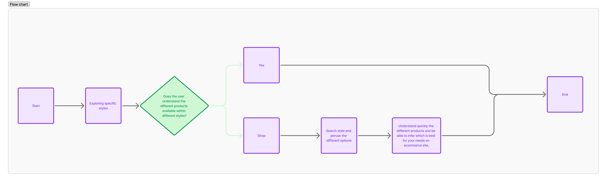
User Flow -
I then mapped out the user flows. One focusing on the processes of first time site shoppers and companies looking to reorder bulk POs. One focusing on the understanding of the different product offerings. One focusing on understanding an individual product.

BOG
Comparison Charts

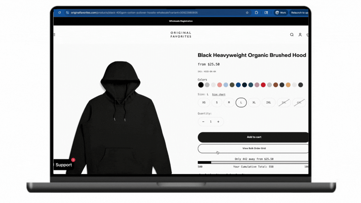
Modernized Product Pages

Quick Reminder of the Brand Guidelines -
Click to see full Brand Guide
Ideate
Time to Design -
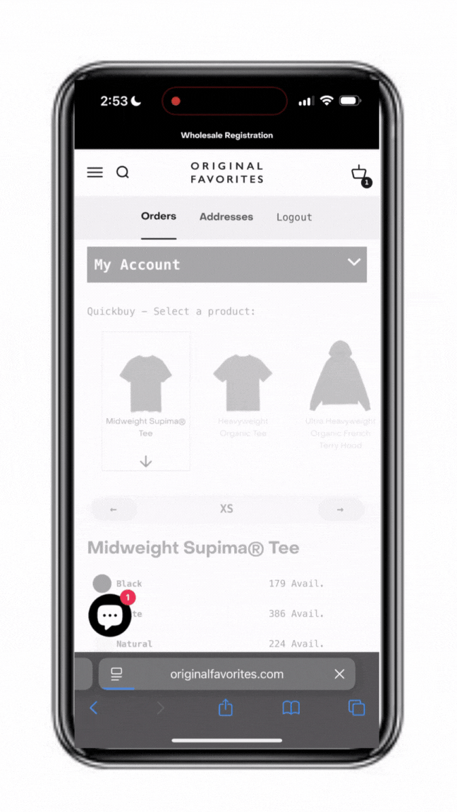
Bulk Order Grid Implementation
Comparison Chart Additions
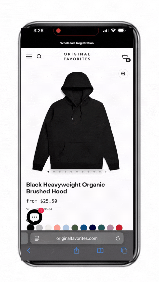
Modernized Product Pages
Wireframing and Prototyping
Prototype
Implementing New Designs -
Bulk Ordering Grid
Comparison Charts
Modernized Product Pages
Test
Usability Testing
Next step was able to test roughly 5 users remotely on each scenario. I sent them the prototype link, explained the project background and presented them with a scenario:
Bulk Order Grid Implementation
Scenario: Navigate and use the bulk order grid for bulk purchasing.
Sub-tasks
Open Original Favorites and use the mass bulk order grid on the account page to place bulk orders for multiple styles.
Use product pages to specifically place bulk orders for specific styles.
Place order.
Comparison Chart Additions
Scenario: Educate and navigate the comparison charts .
Sub-tasks
Open Original Favorites and use style pages to understand the different types of products within one style range .
Use the homepage to understand the different product offerings.
See if the information was digestible and easily understandable.
Modernized Product Pages
Scenario: Navigate and understand the products with the new page layouts.
Sub-tasks
Open Original Favorites and navigate to the product pages.
Use product pages to specifically place bulk orders for specific styles.
See if the information was digestible and easily understandable.
What Was Accomplished:
Post-launch feedback from internal teams and buyers was positive, noting the new site as “much more intuitive and professional.”
While metrics are still being tracked, the sales team reported faster order cycles and fewer support emails around pricing and product info.
What I Learned:
B2B buyers need efficiency over polish — but the right design elevates trust.
Early interviews helped align design direction with real workflows.
Next time, I’d start usability testing earlier to catch small navigation issues sooner.
Outcomes and Reflection -
Next Steps -
What We’re Doing Next:
Monitor and analyze conversion rates and average order values for new vs. returning B2B buyers.
Roll out saved reorder lists and personalized dashboards to increase repeat order efficiency.
Conduct a round of usability testing on mobile to validate navigation improvements and uncover new pain points.
Continue to gather feedback from top buyer segments (promotional companies and decorators) to inform future iterations.
Explore potential integration with backend tools (e.g., inventory, CRM) to reduce manual data handling for both users and the internal team.