Sample Pack Page Redesign
Redesigning a critical product page that focuses on optimizing the customer’s first purchasing experience.

This project involved redesigning the Sample Pack page for Original Favorites to improve the user experience around a key first-touch purchase. For many, the sample pack is their first interaction with the brand, but the existing page lacked clarity and didn’t showcase its value. I led the UX design process, working with the product and marketing teams to create a clearer, more engaging experience that supports confident decision-making when purchased while reflecting the quality of the brand.
Project Overview
Duration: 2 months
Role: UX & UI Design, Visual Design, Branding, Research, Prototyping & Testing
Tools Used: Figma, Adobe Suites, CSS
My Design Process
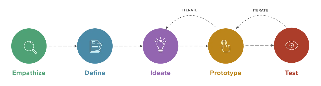
Empathize and Define
Step 1: Research
It all begins with an idea. Maybe you want to launch a business. Maybe you want to turn a hobby into something more. Or maybe you have a creative project to share with the world. Whatever it is, the way you tell your story online can make all the difference.
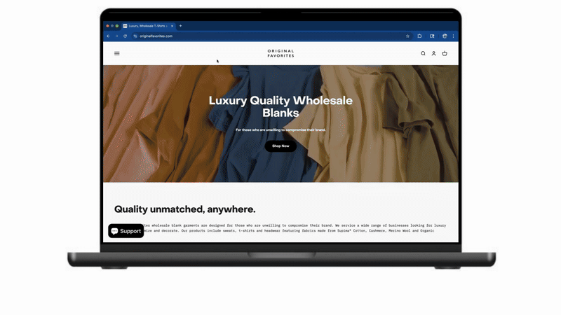
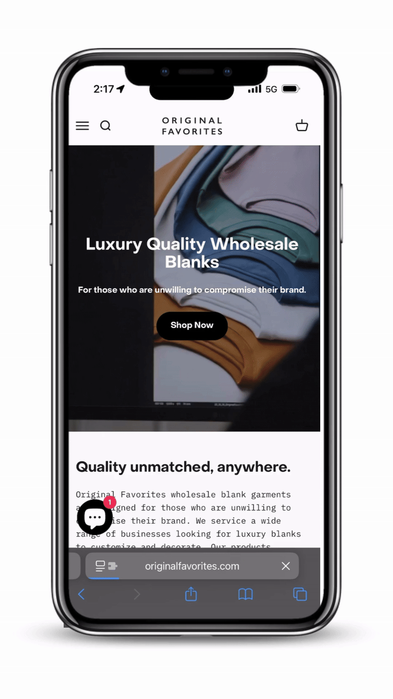
Identify Gaps and Opportunities in Old Design -

Desktop


Mobile

SpectraUSA
Market Research -

AXISM

Wholesale Fashion

Market Research Takeaways -
Ideate and Prototype
Step 2: Prototype
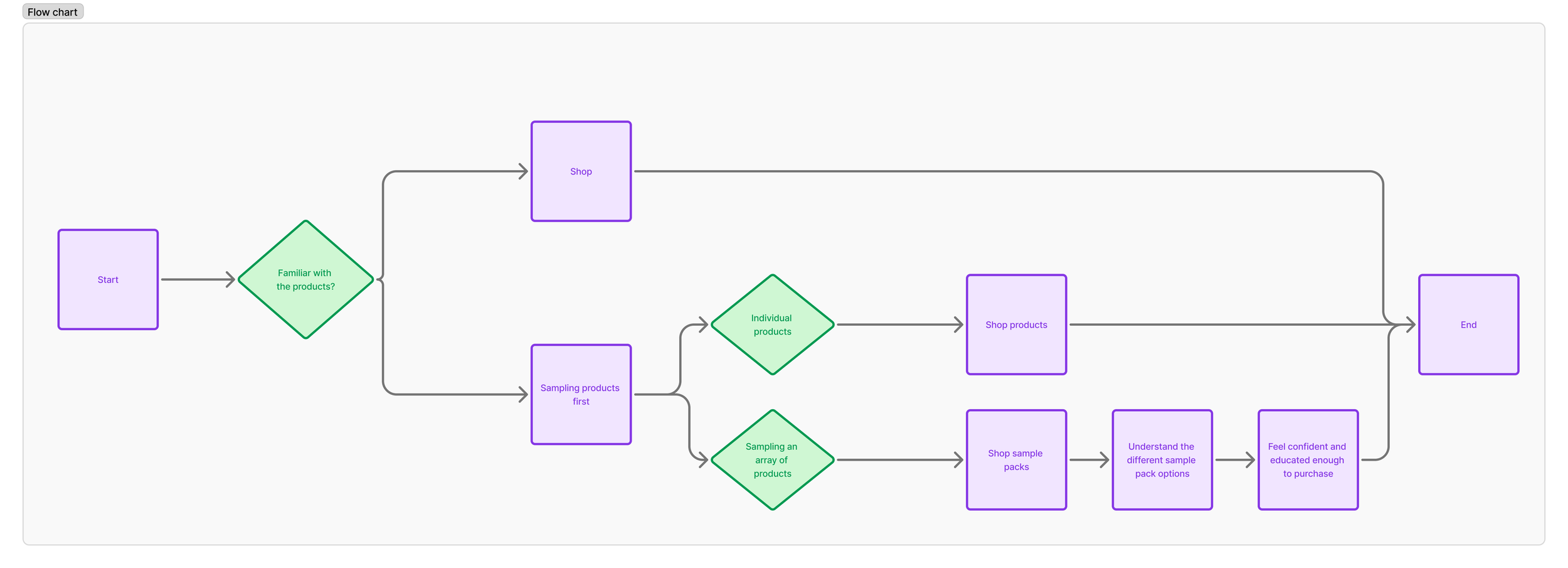
User Flow -
Test
Step 3: Design and Implementation
Usability Testing -
To validate the redesigned Sample Pack page, I conducted usability testing sessions with both first-time and returning wholesale customers. The goal was to assess whether the new layout, content, and interactions made it easier to understand the value of the Sample Pack and complete a purchase.
Tasks:
Find and navigate to the Sample Pack page
Understand what’s included in the pack
Add the correct size to cart
Continue shopping or proceed to checkout

Key Observations:
Users appreciated the simplified content hierarchy and clear callouts
All testers correctly identified what was in the sample and its purpose
The slide-out cart helped maintain shopping momentum, with most users continuing to explore products after adding to cart
One area of confusion was in garment sizing — some users clicked out to other product pages for clarification
Improvements Made:
Added a size chart directly to the Sample Pack page
Included a visual breakdown of what’s in the pack using icons and short descriptions
Highlighted the “What’s Next?” after-purchase experience (e.g. link to bulk orders, sales team)
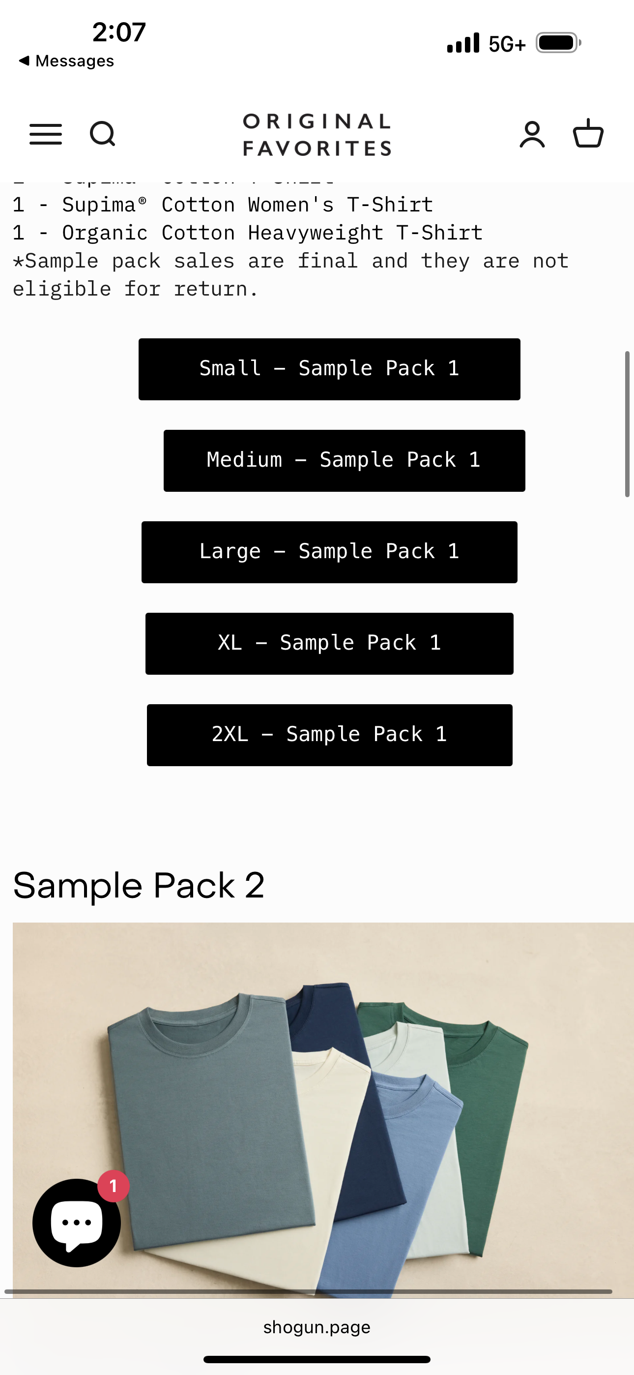
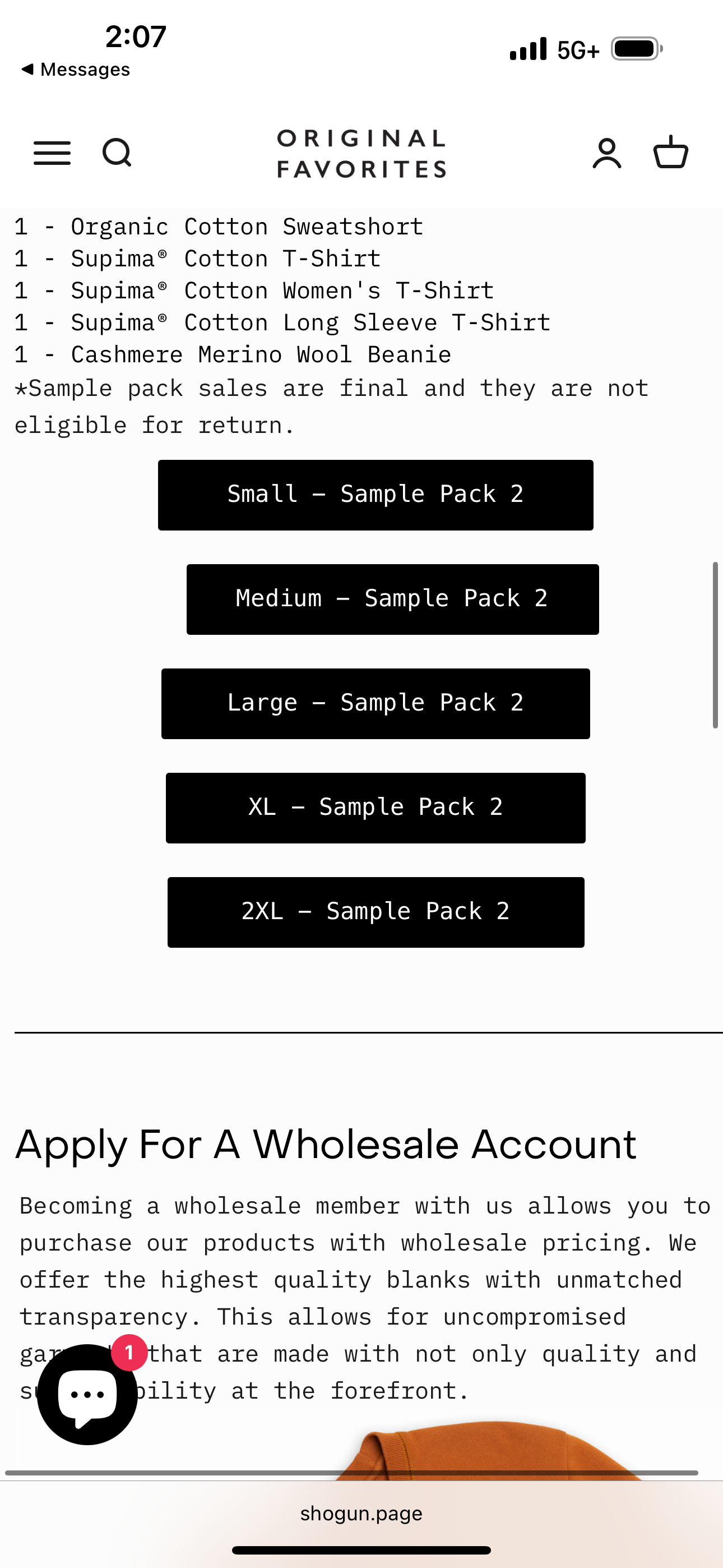
Final Implementation -
Desktop
Mobile
What Was Accomplished:
Streamlined the sample pack page to better explain what’s included and why it’s valuable for first-time wholesale buyers.
Improved layout and messaging to help users quickly understand the product and feel confident ordering.
Positioned the sample pack as a key entry point for building long-term customer relationships.
What We Learned:
Clear, upfront information builds trust, especially for new users seeing the brand for the first time.
Buyers want a mix of product education and visual cues to feel good about sampling.
A well-designed sample experience can do a lot of heavy lifting in the sales funnel.
Outcomes and Reflection -
Next Steps -
What We’re Doing Next:
Test different CTAs on buttons to see what drives more conversions.
Look into adding customer reviews or photos to build more trust and show product quality.
Keep an eye on conversion rates and drop-offs to fine-tune layout and messaging.
Explore applying similar updates to other key intro pages on the website.