
Cart Flow Redesign
Correcting a Broken Purchasing Experience
Improving the add-to-cart functionality to streamline the purchasing process for wholesale and bulk B2B shoppers.

Project Overview
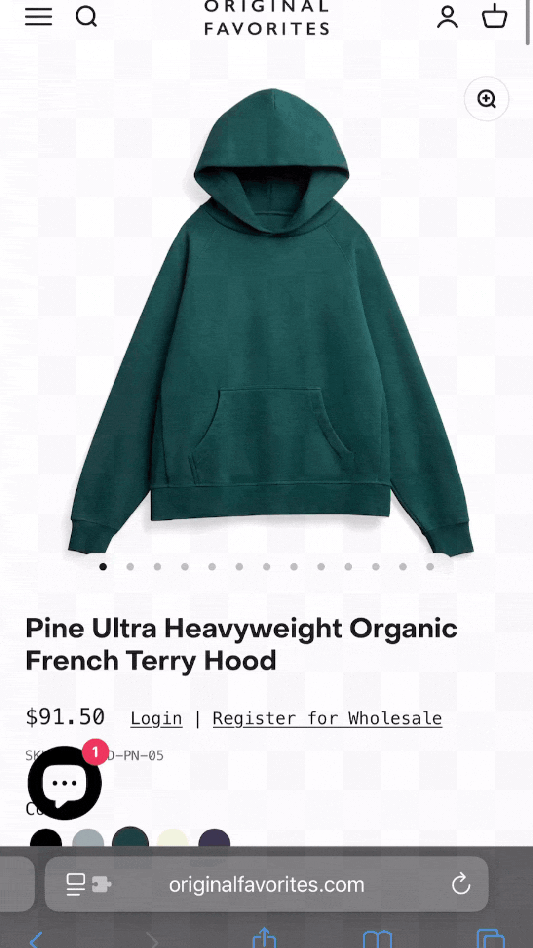
This project aimed to improve the add-to-cart experience on Original Favorites’ website for retail and wholesale customers. The old design redirected users to the cart after each item added, disrupting the entire shopping flow. I supported the UX design by collaborating with developers and founders to introduce a slide-out cart, allowing users to stay on the page while confirming additions, reducing friction and streamlining the experience.
Duration: 3 months
Role: Staff UX/UI Designer
Tools Used: Figma, Hotjar, Miro, Slack, Google Analytics, Google Forms
My Design Process
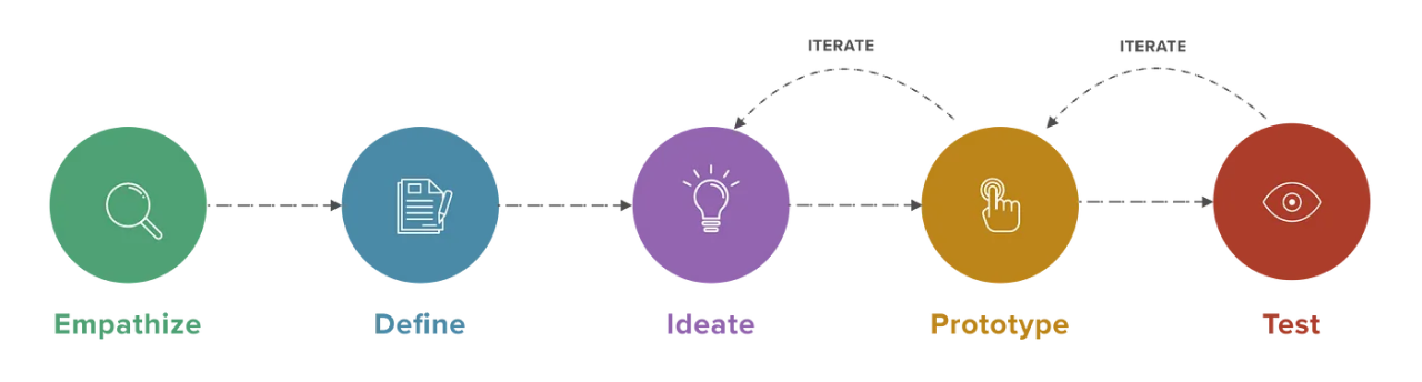
Empathize
Step 1: Research
The Problem -
Understanding the Issue at Hand -
For all buyers, but specifically wholesale buyers, shopping typically involves adding multiple SKUs in different sizes and colors. However, each time a product was added to the cart, users were redirected to a full cart page. This:
Broke the browsing flow
Made it difficult to build larger orders
Increased time-to-checkout
Resulted in missed or duplicated items due to confusion
Internal feedback and Hotjar recordings reinforced the frustration users experienced with this workflow.
Goals -
Create a more intuitive, seamless add-to-cart experience
Reduce friction and allow users to stay in their browsing context
Reduce interaction steps and lower bounce rates
Increase conversion and average order size
We began by looking at both user behavior and team feedback.
Session recordings showed users clicking back and forth between the product and cart pages repeatedly.
Interviews with 5 B2B customers confirmed this experience was both inefficient and mentally taxing.
Analytics revealed a high bounce rate on the cart page when it was triggered unintentionally.
Customer service records showed a consistent irritation with the limitation of the add to cart functionality.
-
Interrupted Shopping Flow: Our users found the redirection after adding each item disruptive and annoying.
-
Desire for Seamless Experience: Our B2B customers preferred staying on the product page to continue browsing and adding items.
-
Outdated Experience: Our users voiced that the disrupted experience felt outdated and felt like it was broken part of the website.
Step 2: Ideation & Exploration
Ideate
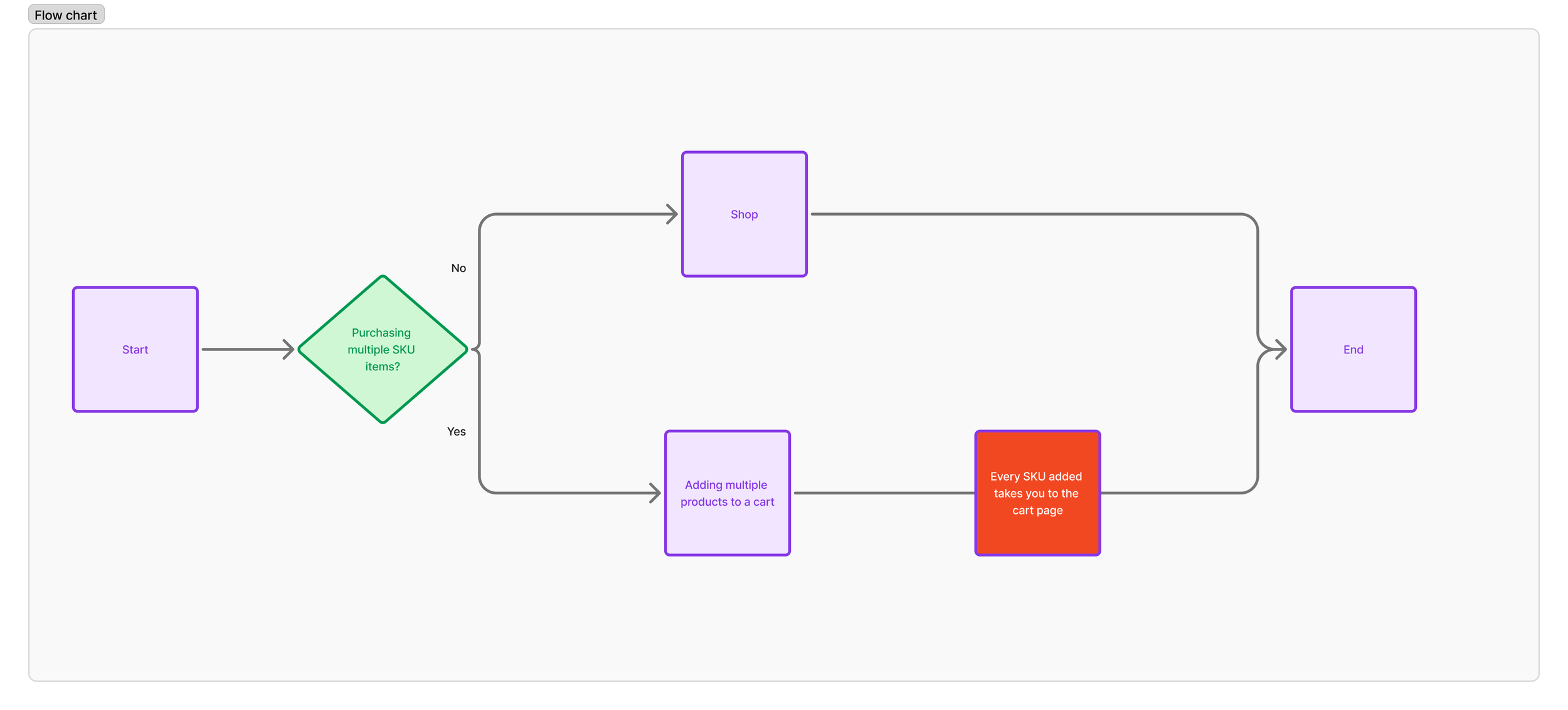
User Flow -
Three primary design concepts emerged:
Confirmation modal
Sticky cart bar
Slide-out drawer
Ideation -
Confirmation Modal
Description:
This approach triggers a pop-up modal at the center of the screen each time a product is added. The modal includes a short confirmation message and offers two options: “Go to Cart” or “Continue Shopping.”
Pros:
Clear visual feedback that confirms the action
Familiar to most users
Offers a direct path to checkout
Cons:
Interrupts browsing flow
Requires manual dismissal before continuing
Can feel repetitive when adding multiple items
Disruptive on smaller mobile screens
Sticky Cart Bar
Description:
A persistent horizontal bar appears at the bottom of the screen after an item is added. It shows a cart summary, including subtotal and item count, and includes a checkout button or link to the full cart.
Pros:
Less disruptive than a modal
Keeps checkout accessible without leaving the page
Responsive and mobile-friendly
Cons:
Limited space to show meaningful cart details
May be too subtle for some users to notice
Doesn’t show which specific item was added
Could conflict visually with other page elements
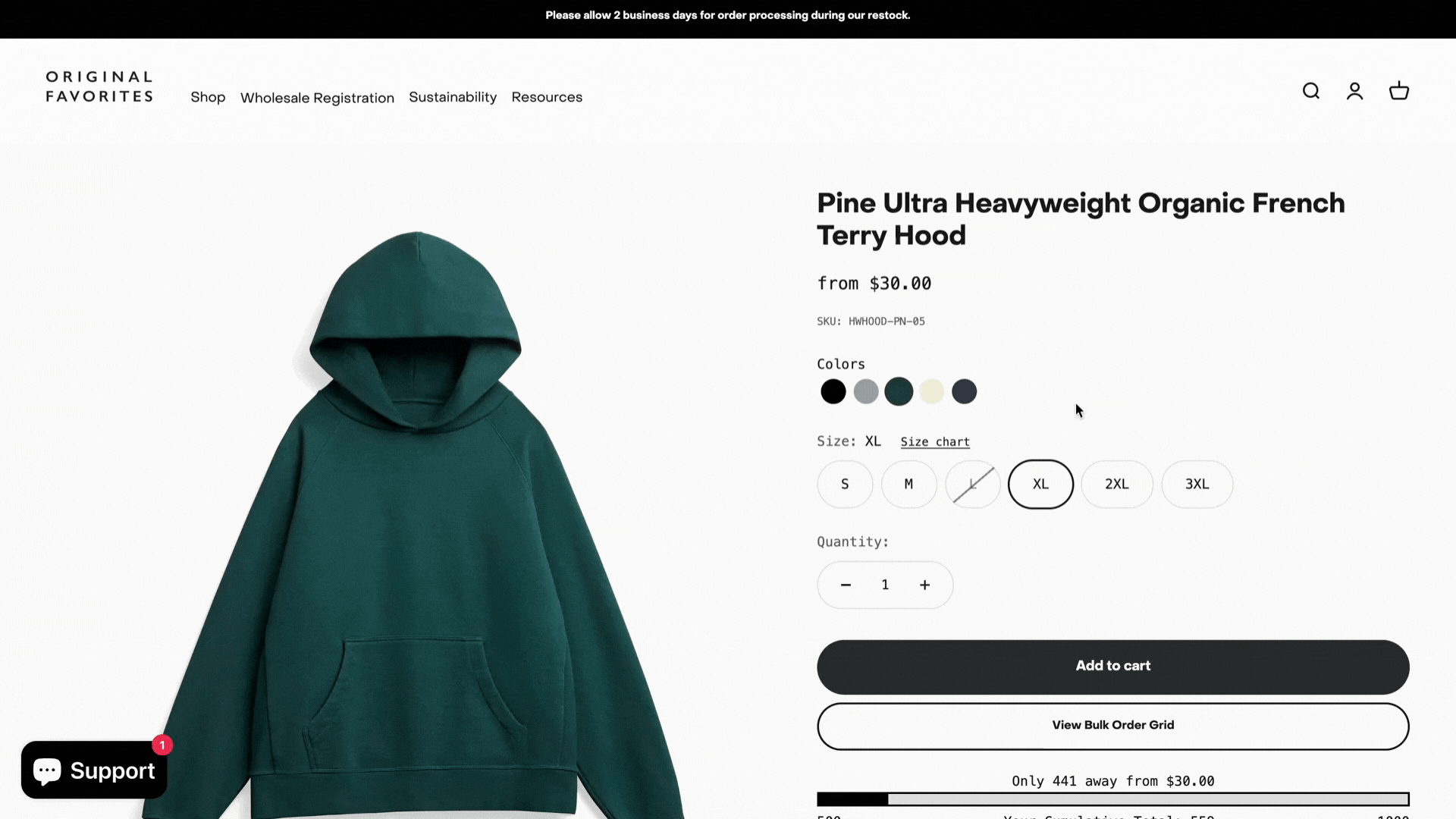
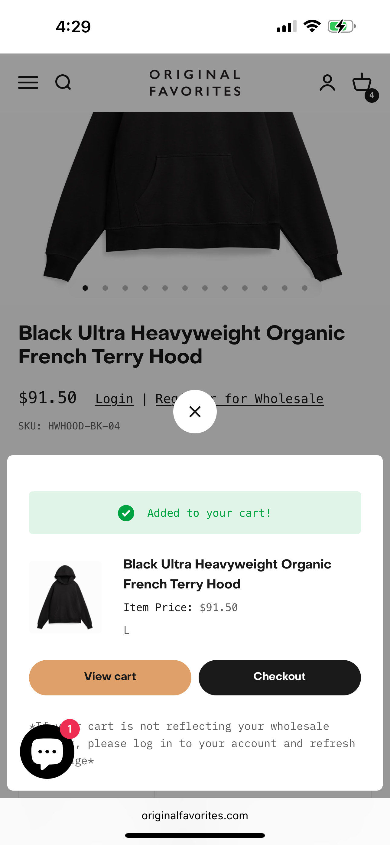
Slide-out Drawer
Description:
A cart drawer slides in from the right side of the screen (or bottom on mobile) after a product is added. It shows the item just added, the full contents of the cart, the subtotal, and provides a prominent checkout CTA. Users can close the drawer to continue shopping.
Pros:
Maintains product browsing context
Offers immediate access to full cart details
Scalable for additional features like quantity adjustments or bundles
Feels modern and intuitive
Cons:
Slightly more complex to implement
Requires thoughtful mobile design and accessibility support
Needs testing to avoid overwhelming the user visually
Decision Matrix -

Conclusion -
The slide-out drawer emerged as the strongest solution, it offered clarity without interruption, scaled with user needs, and provided a better balance between feedback and flow. It aligned well with both user expectations and business goals, especially for customers adding many items in a single session.
Goals and Success Metrics
Reduce Cart Page Bounce Rates
Streamline Checkout Process
Increase Average Cart Size
Ideation Phase

Desktop
Mobile

Design and Implementation
Desktop

Mobile
Outcomes and Reflection:
What Was Accomplished:
Streamlined the checkout flow to allow the customer to seamlessly shop for multiple SKUs across multiple styles.
Improved layout and messaging to help add to cart messaging fit in seamlessly with the current shopping experience.
Sectioned the interim add to cart validation from the final cart page for users to have both options dependent on whether they are still shopping or ready to check out.
What We Learned:
Uninterrupted cart updates allow the customer to intuitively know that they’ve added the product while still being able to focus on the purchasing of other products or sizes.
Buyers want a small validation that they have successfully added a product to cart as well as a full screen cart page when they are ready to check out.
A well-designed add to cart experience can do a lot of heavy lifting in the success of customers checking out.
What We’re Doing Next:
Test different CTAs on buttons to see what drives more conversions as well as slide out vs slide up.
Look into adding cumulative pricing bars per style to allow the customer to know where they are at in comparison to the next pricing tier.
Keep an eye on conversion rates and cart page bounce rates to help validate success of the design.
Explore applying simpler ways for specifically our repeat wholesale customers to purchase large POs directly from the website.